THANK YOU !
FOR YOUR INTEREST IN MODERN FLOOR LAMPS
Fans of Bates Motel will love this article. It has everything you need to get your modern home decor just in tune with one of the most successful TV Shows in the history of modern tv and it will give your home that twists that only makes it better with some Pantone touches and the occasional vintage decor item. Today we present you the Bates Motel Blue to make an outstanding appearance in your home revamp project!
READ ALSO: WHAT’S HOT ON PINTEREST: FLOOR LIGHTING DESIGNS W/ PANTONE!

Yes, it is true. Pantone launched a colour to serve the hit tv show, Bates Motel – Bates Motel Blue. A unique neon metallic shade to make a homage to one of the greatest minds in the world of cinema – Alfred Hitchcock. The mastermind behind Norman Bates the hit TV show is a prequel to the movie that won the hearts of millions through time.

In collaboration with A&E Network, Pantone Colour Institute made a unique medium to honour the fantastic movie and to make a connection with the world of stars, the colour that is used to transmit a sense of peace and quiet in this instance is anything but that. – Just as Pantone claims – “Norma’s decision to employ this radiantly intense blue in the Bates Motel sign proves itself an excellent misdirect […] so much mystery and deceit lies under the surface of his fragile psyche.”


Blue is represented throughout the interior design world in plenty. Eiseman claimed and the right tone with “Metallics we know are classic”. In a world where colour is such as strong sense of the mind, we must claim it back in unexpected ways. Combine it with classics such as black when it comes to lighting and you’re right on your tracks.

Along with some mid-century lighting designs to fit your home, go for blue when you want to incorporate that relaxing and calm state within a charming living room design. An exhilarating blue that instantly engages with your comfy side.
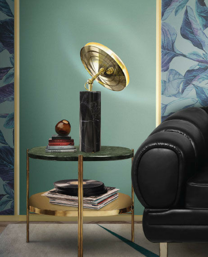
Wallpaper is one of the best choices for your interior. A one of a kind trend, it looks amazing with some floral patterns and some golden touches to your living room layout. A vintage touch just bates motel style.

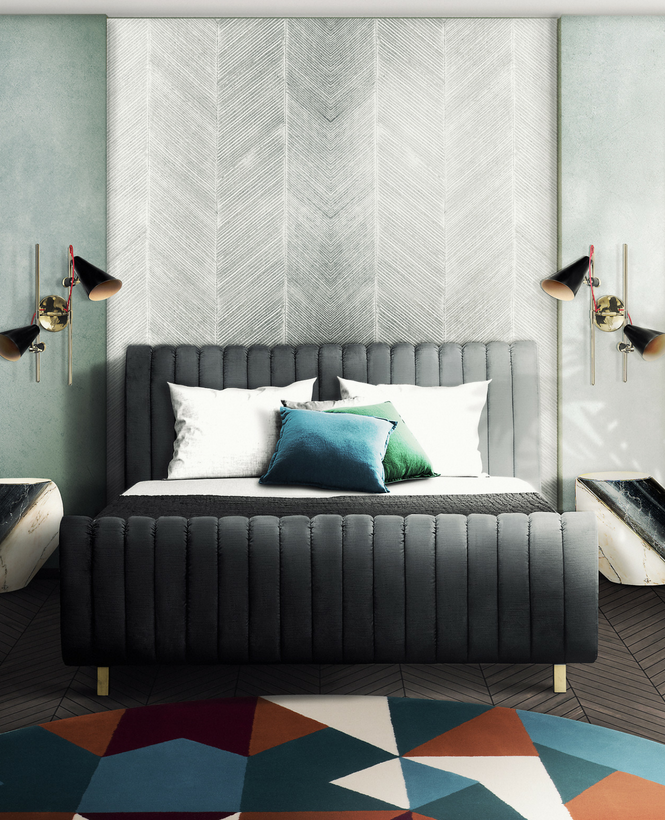
Blue fits all ages and stages. Be it in a living room or in the bedroom, blue accents filter the neutrality of the natural and neutral tones. Looking perfect in a combination of patterns and colours, make sure that your home interior decor doesn’t get too out of hand.
READ ALSO: NEWS FLASH : BUBBLE SHAPED LIGHTING COLLECTION BY ROSIE LI
You can visit our Pinterest boards in order to get more inspirations. Get more ideas for your projects and find functional, stylish and sizable lighting and furniture choices. Make sure to download our ‘Interior Design Tips for a Well-Lit Home‘ eBook!


